dh's two cents on design
December 5, 2013
Anthony Horst
I was recently introduced to Anthony Horst by my friend Famt. I normally don't like the networking game, but in this case I am more than happy to entertain it in this one case. Horst runs his own type foundry specializing in Rock 'n' Roll, Death Metal, black metal and grindcore logos. I've bought several CDs of the bands that he works with and each logo is a work of genius, entertaining the notions of what fringe 'experts' consider proper for their respective sub-genres and incorporating the craft of a professional typographer. Here is is website.
December 1, 2013
November 18, 2013
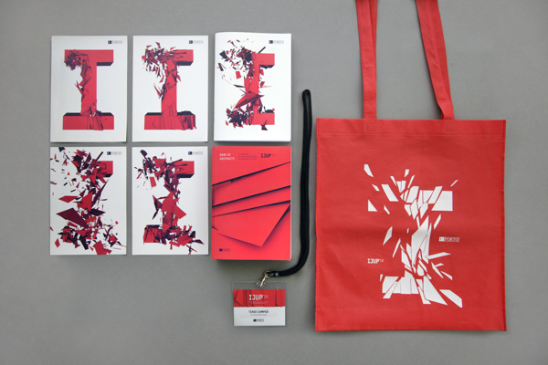
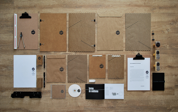
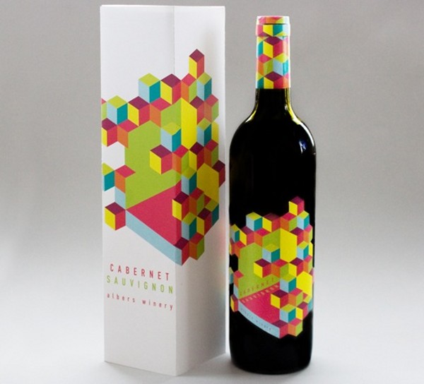
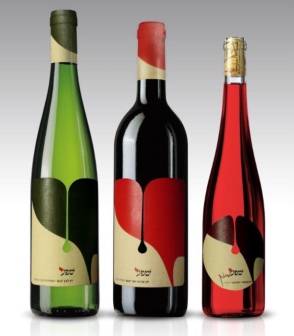
Cool Branding Projects
Been doing a little research for the upcoming packaging project. Ran across these and wouldn't mind sourcing them as inspiration. Here's the link.
October 31, 2013
Bhagavad Gita Cover Project
I've decided for the book cover project to take on the Bhagavad Gita. It's no secret that I find this work to be rather important in my personal life, not for religious purposes but for personal reasons including conflict resolution and inner happiness.
It has been enjoyed and utilized as a source of inspiration by such Indian figures as the late Ravi Shankar and Mahatma Gandhi. Notable Westerners that enjoyed it are Thoreau and Emerson, who along with other American authors were coined to be of the "transcendentalist" movement.
Modern covers for the Gita in the east are pretty basic and reminiscent of a Gideon Bible in a hotel room.
But what I've noticed about the western edition, particularly the ones that are afforded to us by the Hare Krishnas at the price of a small donation, is that they have two typically American design attributes that I am not always compelled by: the Characters Arjuna and Rama in antiquated illustration and the title in serif font. I find these to be symptoms for American design (or moreso remedies for an American audience). This has been investigated before in the differences between Japanese and American game art where Japanese and East Asian markets are more compelled to make themes important over characters. American design is centered around actors, musicians and characters rather than how the subject matter is supposed to make one feel. Here are some examples of western covers:
What I want to do will include a thematic role of the Gita, exclude the characters (or any Deities) and as a kicker of either a better set of serif type or a sans-serif that I also promise to be snazzy. See you in a couple of days.
It has been enjoyed and utilized as a source of inspiration by such Indian figures as the late Ravi Shankar and Mahatma Gandhi. Notable Westerners that enjoyed it are Thoreau and Emerson, who along with other American authors were coined to be of the "transcendentalist" movement.
Modern covers for the Gita in the east are pretty basic and reminiscent of a Gideon Bible in a hotel room.
 |
| (albeit a bit snazzier) |
What I want to do will include a thematic role of the Gita, exclude the characters (or any Deities) and as a kicker of either a better set of serif type or a sans-serif that I also promise to be snazzy. See you in a couple of days.
October 30, 2013
Poster Project
I'm really happy with how this one turned out. Objective: make a poster for a relevant event in the area sometime recently/in the near future. I chose Poncili Creacion theatre troupe, who performed at the half-venue half-residential Big House at 368 Ponce de Leon. Here are my results.
 |
| dark figure and crow |
 |
| homunculus |
 |
| final poster |
October 14, 2013
Subscribe to:
Posts (Atom)


